Conservatories & Garden Buildings

This is an excerpt from the Book called “Painting Houses & Gardens In Watercolor” by Richard Taylor. Continue reading to learn more about Conservatories & Garden Buildings, thanks to the author.

As you leave the front of the house and start to move around to the back, a wealth of treasures is likely to unfold-decorative conservatories, potting-sheds, summerhouses draped in honeysuckle, and so on. 

Always take time to take a look inside these buildings for either the “accidental” still life or the ingredients to build your own. A vast range of colors and textures is found on and inside these delightful features and the techniques required to paint them are examined on the following pages. 

Stone And Brick Cottage 

11 × 11 in (28 × 28 cm) 

Inside The Conservatory 

The idea of a conservatory or glass extension to act as a halfway point between the house and the garden is particularly appealing from the inside a conservatory is understandably popular with artists. You can sit in warmth and comfort and look out across the garden or courtyard (or whatever particular view you happen to have) and paint this at leisure. Sometimes, though, it is a good idea to turn your back on the window and the outside view and paint the actual scene inside the conservatory itself.

One of the key features that you will need to consider when painting inside any structure with a high proportion of glass is the quality of light. Many conservatories are three-quarters glass and one-quarter house wall. This means that at certain times of the day the light will not be strong (being blocked out by the house), but at other times it will stream through the windows, casting strong angular, hard-edged shadows and illuminating everything it falls upon. This is, I believe, the best time to paint. 

Painting The Light 

To create this type of scene, establish the key colors for the furniture, floor, walls, and plants. Paint these features with attention to their shape, but no real concern yet for shadows and shading. When this has dried, consider for a moment the quality of the light. A cold winter’s day will cast a blue/gray shadow, a fresh spring day will cast a sharp blue/violet shadow, yet a warm summer’s day will cast a deep purple/violet shadow. Make your decision and mix your colors.

Inside The Conservatory

Painting the shadows requires some bravery. Using a medium-size brush, paint the shadows that you see directly onto your picture with a one-stroke action. Quickly mix up a darker version and, while the paint is still damp, paint this “underneath” the very darkest areas and allow this to dry to a graduated finish. 

Sun-filled conservatory 

12½ × 9½ in (32 × 24 cm) 

Harsh lighting throws hard-edged shadows across the floor, table, and chairs. The dominant shadows were painted onto a dry underwash, using a “one stroke” action and resisting the temptation to go back over the applied paint. The deepest shadows in the plants are dark to balance the deep shadows underneath the tables and chairs. Areas outside the conservatory were painted as soft-edged, blurred images. 

Small studies of the way that “architectural” plants-those with strong, clear-cut shapes-visually interact with softer-looking furniture help you to understand the nature of these elements. The basic color mix for these conservatory plants was created with Raw Sienna and Sap Green, while the darker sections were created by adding a touch of French Ultramarine. 

Thumbnail sketches of individual plants help you understand the spaces that they require within a composition. Look for the twists and turns in plants-remember that each leaf has an underside. Paint these onto dry paper to allow precision in placing the shading. Use the white paper to act as the central vein that often creates a slight ridge on large leaves. 

Outside The Conservatory 

The symmetrical lines and natural geometry of houses can be broken by the addition of a conservatory to the side or back. For the artist such a building can make a welcome addition to an otherwise flat wall. 

There are key factors to consider in looking at the structure of a conservatory with a view to painting it-how many sides are visible, are all the sides at right angles, and what about the angle of the roof? All of these will determine the approach to take in planning a picture or study. The main concern, however, must be how to paint all of the glass, or, more to the point, how to paint all that you can see through the glass. First, you must establish the framework of the conservatory, especially the trim and frames that the glass is set into; this will help to indicate where the sheets of transparent glass are located. Then look for any specific light reflections-these often occur when one sheet of glass is set at a slightly different angle to the others-and make a light pencil mark, recording the shape. 

Brick Conservatory 

11 × 8½ in (28 × 22 cm) 

Paint the diffusing effects of glass by using a lot of water and dropping the colors onto wet paper, allowing them to bleed into soft shapes without any clear definition. Foreground shapes need a little more clarity, so allow them to dry with slightly harder edges. Reflections from the sky will appear to be very light, but a little color will allow the white window frames to still be seen. 

In this study the change of valve from light to dark occurred through three distinct stages. Notice that white blinds do not appear pure white when viewed through glass. So some darkening is required to make them appear to “sit back” from the glass front. Reflections are best painted onto damp paint; just drop on some of the object being reflected and allow it to bleed, softening the edges. 

Painting Diffused Color 

To start painting first flood the area inside the conservatory with plain water, working carefully around the white shapes that you have just marked and watch closely as the water sinks into the paper. When the surface water has sunk in, drop in the colors of the objects that you can see through the glass. These colors will dilute considerably as they soak into the damp paper and will also blend a little, creating soft, diffused edges, removing their clarity and suggesting that they are being viewed through slightly dusty glass. 

When this process is complete you might wish to take a small brush and, using the tip only, “dot” in a few darker shapes in flowers, leaves, and so on to give a slight “lift” to the interior without adding any real detail that would contradict the softness of the diffused colors already established.

Painting Diffused Color 

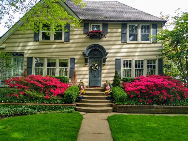
“Accidental” still life groups can be found anywhere. The way in which a pair of muddy rubber boots sat on the terracotta tiled steps proved irresistible for a thumbnail sketch. 

Sheds And Outbuildings 

At the bottom of many gardens are to be found wooden sheds or brick outbuildings. They are often passed by for more instantly obvious subjects in a garden such as gnarled trees, flower beds, stone fountains, and so on, but these structures can themselves be visually attractive subjects.  

While the appearance of an old, weather-beaten, musty potting-shed can be particularly appealing from the outside, you may well find a whole host of treasures inside, ranging from cracked terracotta pots to rusting garden implements and wheelbarrows. If space is tight and you cannot get inside to paint these wonderfully textured subjects, why not take them outside and arrange them yourself. We have already considered “accidental” still life groups, but there is no reason at all why you should not establish an intentional still life group where you take control of the colors, shapes, shadows, and textures, and how they all work together in a composition. 

Visual Interaction 

Much of the appeal, however, of this type of painting is considering how the fabric of the old garden buildings and gardening implements visually interact. Shadows cast onto overlapping wood, for example, need to be carefully observed for the jagged shapes that are produced. 

Garden Shed 

12 × 9 in (30 × 23 cm) 

Shadows cast onto overlapping timbers create a “jerky” effect. Notice, too, that the interplay of shapes to be found when gardening implements are stacked up can help to make a composition work particularly well. Tar paper roofs are usually held on with nails and these can provide an interesting feature to an otherwise dull line of paint. 

The way in which many objects share a similar texture, but are separated by strength of color is also a consideration. For example, terracotta pots and rotting wood share remarkably similar textures, both of which may be created by watermarks and granulation, but they are visually separated by their respective colors-the pots would still retain some of the glow of Burnt Sienna while the wood would likely fade to a dull gray tone. 

Lighting is an important consideration when seeking a subject to paint. Strong side lighting, or even lighting from behind, can produce some atmospheric pictures. 

The rusting iron texture of this watering can is helped by the granulating effects of Burnt Sienna, Burnt Umber, and French Ultramarine, all applied separately to wet paper and allowed to bleed and dry unaided. The deepest tones were created by mixing Burnt Umber and French Ultramarine and applying this to dry paper. Look for the “underneath” of handles and this will help you to record the way that they appear to twist and turn. 

Old outbuildings with “stable doors” always provide some interesting features to record. This open door required a little perspective to ensure that it appeared to be sitting at an angle and was not flat against the wall. This was helped even more by the addition of the shadows. 

Summerhouses And Gazebos 

Summerhouses and gazebos are places where we can sit, rest, and relax during the long hot days of summer, often escaping from the intense heat of the day. It is very likely, therefore, that you will feel inclined to paint these garden structures when they are awash with warm shadows cast from the strong sun. 

This simple gazebo was clearly defined by the strength of the greens painted behind it. Look for the change in tone that multisided structures present. Paint the darkest side first, then dilute a little for subsequent sides until you reach the side bathed in full sunlight. 

Summerhouses And Gazebos 

Sometimes you need to “look through” your subject to see how to paint it. The white wood here was not painted at all; it is the greenery behind that gives definition. Allowing colors to blend slightly, especially with outdoor furniture or garden structures such as trelliswork, often results in a more natural appearance. 

I personally recommend a three-stage approach to painting these shadows. First, establish the intensity of the shadow color to be used. French Ultramarine is usually a good base color. For most rich, redolent summer shadows add a touch of Alizarin Crimson; for slightly stronger, more intense tones substitute Winsor Violet (Dioxazine) for the crimson. Having mixed the color, apply this using a medium-size brush onto dry paper. Next, look for the darkest area-often inside the summerhouse where little light can penetrate-and, while the paint is still damp, apply a stronger mixture to strengthen the value. Finally, wash the paint outward at the lighter end of the shadow, creating a dark, middle, and light value, to give the scene more depth. 

Summerhouse 

10½ × 9 in (27 × 23 cm) 

Dark interiors are difficult to paint-too dark a shadow will “flatten” the scene, yet too light a shadow will not create adequate depth. Try to find a corner or edge of wood in dark areas and leave this untouched to prevent the shadow “swamping” the inside. Angled shadows are particularly important as they, too, prevent interiors from looking “flat.” 

Painting Foliage 

As gardens are usually full of greenery during the summer months, general foliage will play a role in any composition featuring garden structures. In fact, many gazebos or white painted woodwork are, in reality, visually defined by the greenery of the garden. 

To produce the intense bluish greens of the summer garden I recommend that you use an underwash of Olive Green. Once this has dried, add a mixture of Sap Green and as much French Ultramarine as you dare before you think that the mixture can no longer be called green. Then, working onto dry paper, using a small brush, “draws” the darkest areas of foliage. This will push the dry Olive Green color forward, contributing to the three-dimensional effect of your picture. To soften the effect you can “wash out” the paint towards the bottom of the particular bush or clump of greenery, but leave the paint to dry with a hard line at the top-this will serve to represent the shapes of some of the leaves. 

With the darkest values established, enhance your greens even more. Experiment by adding yellows to create a wealth of new middle values. 

Get a free Quote
Get a Free Estimate
Conservatories & Garden Buildings